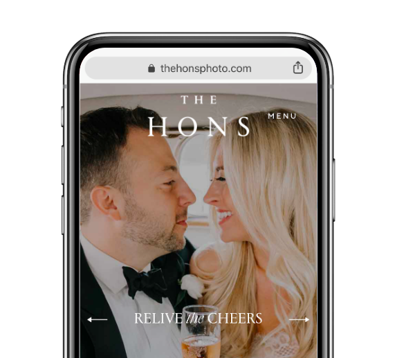
65% of Couples Are Looking You Up on a Phone — Here’s What To Do About That

Here’s the thing. Couples are planning their weddings on their phones. And we’re not only talking about using their phones to browse photos on social media for inspiration. In fact, 65% of couples report using their phones to look you up and do their wedding pro research.
So what happens when they find you and discover your website? Is your website mobile-friendly and fast? And does it articulate your brand? Is it as personal and warm as possible? Here, five very important questions to ask yourself!
1. Do you make it a top priority to have a well-designed website with a fast load time?
If your site doesn’t look fabulous on a phone (as in looks just as good if not better on a phone than a desktop), you are likely losing out on client inquiries and leads. In fact, 38% of people will stop engaging with your website if the layout or content is unattractive, according to a 2015 Adobe study.
If you answered no: Consider an out-of-the-box website solution like SquareSpace or Wix. Templates on these sites are designed with the phone and speed in mind!
2. Is your contact information on the home page?
When a couple finds you through your storefront, social, or via search and clicks over to your website, they need confirmation that they’re in the right place and they need to know how to take business with you to the next step. Almost half of visitors, 44% that is, will leave a business website if there isn’t contact information or phone number, according to a 2015 Ko Marketing study. Add to that, 51% of people think “thorough contact information” is the most important element missing from many company websites.
If you answered no: Make it so!
3. Do you have a nice, large, on-brand hero photo up top to represent your brand?
Your photos are incredibly important to making that first impression and getting clients to stick around and contact you. In fact, 94% of first impressions of your website are based on the design and photos. That’s why it’s critical that you not only have your logo front and center on your site but that you’re using strong photos to articulate the work or product you provide.
If you answered no: Make sure your website template is set up to accommodate a large hero image. And don’t set it and forget it. Test different photos on your home page (compare the bounce rate and conversion rate between visitors and clicks to contact you) to make sure that you have the right one.
4. Is the copy on the page short, concise and personal?
Even though most first impressions are based on the design and photos, the copy on your website matters. Why? Because in a very limited amount of real estate on the phone screen, your copy has to be able to succinctly articulate who you are, what you do and why they should pick you.
If you answered no: Put your editor’s hat on. Look at the copy you have on your website and challenge yourself to shorten it. Be relentless with it. A good rule of thumb: you probably want fewer than 5 sentences total on your main screen and 5-7 words max above the fold.
5. Is there an easy way to contact you from the main screen?
One of the biggest mistake wedding pros make with their websites is to bury the call to action on their website. It’s not enough to have your contact information in small type face at the bottom of your main screen. If you want them to take action after visiting your website, you have to guide your couples.
If you answered no: Ask yourself, what are the two to three ways a couple might be able to contact me? Then make sure it’s been added front and center to your site.
Let's grow your business together!
Start advertising on The Knot and WeddingWire, the top two wedding planning platforms.

